STARFIELD
(CONCEPT)
Project: Self-Led
Role: Designer, Animator
Services: Identity Updates, Promotional Video Animation, Audio Sync
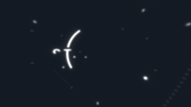
The Starfield branding and marketing has been nothing short of awe-inspiring content. Yet, whenever the logo comes on the screen, I can’t help thinking about the changes I would make to it. Below you will read about my thoughts in the modifications, but I’m a dessert first person, so enjoy the intro animation sequence I made for the updated logo. All audio and visuals are compiled by me.

OLD

NEW

LET’S COMPARE.
Admittedly, these aren’t the best logos for an overlay, but we can still gleam some insights. With my updates in blue, you can see that the original logo’s wordmark sat below the center of the circle, creating a slightly bottom-heavy appearance. I also sought to adjust the font by slicing edges of certain letters to increase the sci-fi effect of the mark, and further separate the T and L from the approaching circle’s edges.
Although I like the changes, I still believe the original mark is more fitting for the game with it’s NASA like interface and UI, but it was a fun exercise.